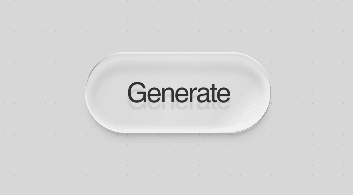
This glass button effect looks simple until you break it down. The polished result does not come from one backdrop-filter rule. It comes from several layers working together: a translucent gradient, blur, inner highlights, a masked border, a soft shadow, and a moving shine effect.
This guide recreates the effect direction inspired by Petr Knoll's CodePen and shows how to use it in both Next.js and Astro.
Credit: the original visual inspiration comes from Petr Knoll's CodePen .
Your browser does not support the video tag.
The effect is built from small details that stack together:
a semi-transparent surface gradient
background blur to pick up whatever sits behind it
inset light and shadow to shape the surface
a thin masked border for the glossy edge
a separate shadow layer so the button feels elevated
a shine pass that moves slightly on hover
a pressed state that changes depth rather than only scaling
If you skip most of these layers and only keep blur, the result usually looks flat.
Keep the structure simple:
< div class = "glass-button-wrap" > < button class = "glass-button" > < span >Generate</ span > </ button > < div class = "glass-button-shadow" ></ div > </ div > Copy Each element has a job:
.glass-button-wrap handles pressed movement.glass-button renders the main glass surfacespan holds the label and shine overlay.glass-button-shadow creates the soft floating shadow
Separating the shadow from the button helps the depth read much better.
The following CSS is the full effect. You can place it in app/globals.css, src/styles/global.css, or another shared stylesheet.
The glass effect reads better when there is something behind it to blur. A soft dotted backdrop works well:
< svg class = "dotted-bg" width = "100%" height = "100%" xmlns = "http://www.w3.org/2000/svg" > < defs > < pattern id = "dottedGrid" width = "30" height = "30" patternUnits = "userSpaceOnUse" > < circle cx Create the component:
type GlassButtonProps = { children ?: React . ReactNode ; onClick ?: () => void ; };
export function GlassButton ({ children = "Generate" , onClick , } : GlassButtonProps ) { return ( < Use it on a page:
import { GlassButton } from "@/components/GlassButton" ;
export default function Page () { return ( < main className = "glass-demo-section" > < svg className = "dotted-bg" width = "100%" height = "100%" Put the shared CSS in app/globals.css or another global stylesheet loaded by your app.
Create the component:
--- const { label = "Generate" } = Astro.props; ---
< div class = "glass-button-wrap" > < button class = "glass-button" > < span >{label}</ span > </ button > < div class = "glass-button-shadow" ></ div > Use it in a page:
--- import GlassButton from "../components/GlassButton.astro" ; import "../styles/global.css" ; ---
< main class = "glass-demo-section" > < svg class = "dotted-bg" width = "100%" height = "100%" xmlns = "http://www.w3.org/2000/svg" Put the shared CSS in src/styles/global.css.
The original effect is oversized for a demo. For a real CTA, reduce padding and font size:
.glass-button span { padding : 0.9 rem 1.6 rem ; font-size : 1 rem ; letter-spacing : -0.02 em ; } Copy For a larger hero button:
.glass-button span { padding : 1 rem 2 rem ; font-size : 1.125 rem ; letter-spacing : -0.02 em ; } Copy On dark surfaces, tweak the contrast instead of redoing the whole component:
.glass-demo-section { background : rgb ( 20 , 20 , 20 ); }
.glass-button span { color : rgba ( 255 , 255 , 255 , 0.9 ); text-shadow : 0 0.25 em 0.05 em rgba ( 0 background: linear-gradient( -75deg, rgba(255, 255, 255, 0 .05 ), rgba(255, 255, 255, 0 .22 ), rgba(255, 255, 255, 0 .05 ) ); Copy This gives the button a reflective body instead of a flat fill.
backdrop-filter : blur(clamp(1px, 0 .125em , 4px)); Copy This pulls background texture into the button. Without something behind the button, the effect will feel weaker.
mask : linear-gradient( #000 0 0) content-box , linear-gradient( #000 0 0); mask-composite : exclude; Copy This lets the border appear as a thin shell around the button rather than a full overlay.
The shadow is not attached directly to the button surface. That keeps the blur and the elevation feeling cleaner.
The hover and active states do not just scale the component. They also shift border angle, shine position, and depth. That is what makes the interaction feel premium.
If you use this in production, keep these details:
keep visible :focus-visible styles
respect prefers-reduced-motion
avoid very low-contrast text on busy backgrounds
use a real <button> for actions and a real <a> for navigation
The nice part about this effect is that it is mostly reusable CSS. Once the layers are in place, you can scale the typography, colors, and spacing to fit almost any interface.
If you want the component to feel expensive, focus less on "glassmorphism" as a label and more on the tiny visual decisions: edge contrast, shadow softness, shine direction, and pressed depth.
@property --glass-angle-border { syntax: "<angle > "; inherits: false; initial-value : -75deg; }
@property --glass-angle-shine { syntax: "<angle > "; inherits: false; initial-value : -45deg; }
:root { --glass-hover-time : 400 ms ; --glass-hover-ease : cubic-bezier ( 0.25 , 1 , 0.5 , 1 ); }
.glass-demo-section { position : relative ; min-height : 100 vh ; display : grid ; place-items : center ; overflow : hidden ; background : rgb ( 215 , 215 , 215 ); font-family : Inter, system-ui , sans-serif ; }
.dotted-bg { position : absolute ; inset : 0 ; z-index : 0 ; pointer-events : none ; }
.glass-button-wrap { position : relative ; z-index : 2 ; display : inline-flex ; border-radius : 999 px ; background : transparent ; transition : transform var ( --glass-hover-time ) var ( --glass-hover-ease ); }
.glass-button-shadow { --shadow-cutoff-fix : 2 em ; position : absolute ; width : calc ( 100 % + var ( --shadow-cutoff-fix )); height : calc ( 100 % + var ( --shadow-cutoff-fix )); top : calc ( 0 % - var ( --shadow-cutoff-fix ) / 2 ); left : calc ( 0 % - var ( --shadow-cutoff-fix ) / 2 ); filter : blur ( clamp ( 2 px , 0.125 em , 12 px )); pointer-events : none ; overflow : visible ; }
.glass-button-shadow::after { content : "" ; position : absolute ; inset : 0 ; border-radius : 999 px ; width : calc ( 100 % - var ( --shadow-cutoff-fix ) - 0.25 em ); height : calc ( 100 % - var ( --shadow-cutoff-fix ) - 0.25 em ); top : calc ( var ( --shadow-cutoff-fix ) - 0.5 em ); left : calc ( var ( --shadow-cutoff-fix ) - 0.875 em ); background : linear-gradient ( 180 deg , rgba ( 0 , 0 , 0 , 0.2 ), rgba ( 0 , 0 , 0 , 0.1 )); padding : 0.125 em ; box-sizing : border-box ; mask : linear-gradient ( #000 0 0 ) content-box , linear-gradient ( #000 0 0 ); mask-composite : exclude ; transition : all var ( --glass-hover-time ) var ( --glass-hover-ease ); }
.glass-button { --border-width : clamp ( 1 px , 0.0625 em , 4 px ); all : unset ; position : relative ; z-index : 2 ; cursor : pointer ; border-radius : 999 px ; -webkit-tap-highlight-color : transparent ; background : linear-gradient ( -75 deg , rgba ( 255 , 255 , 255 , 0.05 ), rgba ( 255 , 255 , 255 , 0.22 ), rgba ( 255 , 255 , 255 , 0.05 ) ); box-shadow : inset 0 0.125 em 0.125 em rgba ( 0 , 0 , 0 , 0.05 ), inset 0 -0.125 em 0.125 em rgba ( 255 , 255 , 255 , 0.55 ), 0 0.25 em 0.125 em -0.125 em rgba ( 0 , 0 , 0 , 0.2 ), 0 0 0.1 em 0.25 em inset rgba ( 255 , 255 , 255 , 0.2 ); backdrop-filter : blur ( clamp ( 1 px , 0.125 em , 4 px )); -webkit-backdrop-filter : blur ( clamp ( 1 px , 0.125 em , 4 px )); transition : transform var ( --glass-hover-time ) var ( --glass-hover-ease ), box-shadow var ( --glass-hover-time ) var ( --glass-hover-ease ), backdrop-filter var ( --glass-hover-time ) var ( --glass-hover-ease ); }
.glass-button span { position : relative ; display : block ; padding : 0.875 em 1.5 em ; font-family : Inter, system-ui , sans-serif ; font-size : clamp ( 2 rem , 4 vw , 5 rem ); font-weight : 500 ; line-height : 1 ; letter-spacing : -0.05 em ; color : rgb ( 50 , 50 , 50 ); user-select : none ; text-shadow : 0 0.25 em 0.05 em rgba ( 0 , 0 , 0 , 0.1 ); transition : text-shadow var ( --glass-hover-time ) var ( --glass-hover-ease ); }
.glass-button span ::after { content : "" ; position : absolute ; z-index : 3 ; inset : calc ( var ( --border-width ) / 2 ); border-radius : 999 px ; pointer-events : none ; background : linear-gradient ( var ( --glass-angle-shine ), rgba ( 255 , 255 , 255 , 0 ) 0 % , rgba ( 255 , 255 , 255 , 0.5 ) 40 % , rgba ( 255 , 255 , 255 , 0.5 ) 50 % , rgba ( 255 , 255 , 255 , 0 ) 55 % ); background-size : 200 % 200 % ; background-position : 0 % 50 % ; background-repeat : no-repeat ; mix-blend-mode : screen ; transition : background-position calc ( var ( --glass-hover-time ) * 1.25 ) var ( --glass-hover-ease ), --glass-angle-shine calc ( var ( --glass-hover-time ) * 1.25 ) var ( --glass-hover-ease ); }
.glass-button::after { content : "" ; position : absolute ; z-index : 1 ; width : calc ( 100 % + var ( --border-width )); height : calc ( 100 % + var ( --border-width )); top : calc ( 0 % - var ( --border-width ) / 2 ); left : calc ( 0 % - var ( --border-width ) / 2 ); border-radius : 999 px ; padding : var ( --border-width ); box-sizing : border-box ; background : conic-gradient ( from var ( --glass-angle-border ) at 50 % 50 % , rgba ( 0 , 0 , 0 , 0.45 ), rgba ( 0 , 0 , 0 , 0 ) 5 % 40 % , rgba ( 0 , 0 , 0 , 0.45 ) 50 % , rgba ( 0 , 0 , 0 , 0 ) 60 % 95 % , rgba ( 0 , 0 , 0 , 0.45 ) ), linear-gradient ( 180 deg , rgba ( 255 , 255 , 255 , 0.55 ), rgba ( 255 , 255 , 255 , 0.55 )); mask : linear-gradient ( #000 0 0 ) content-box , linear-gradient ( #000 0 0 ); mask-composite : exclude ; box-shadow : inset 0 0 0 calc ( var ( --border-width ) / 2 ) rgba ( 255 , 255 , 255 , 0.5 ); transition : --glass-angle-border 500 ms ease , box-shadow var ( --glass-hover-time ) var ( --glass-hover-ease ); }
.glass-button:hover { transform : scale ( 0.975 ); backdrop-filter : blur ( 0.01 em ); -webkit-backdrop-filter : blur ( 0.01 em ); box-shadow : inset 0 0.125 em 0.125 em rgba ( 0 , 0 , 0 , 0.05 ), inset 0 -0.125 em 0.125 em rgba ( 255 , 255 , 255 , 0.5 ), 0 0.15 em 0.05 em -0.1 em rgba ( 0 , 0 , 0 , 0.25 ), 0 0 0.05 em 0.1 em inset rgba ( 255 , 255 , 255 , 0.5 ); }
.glass-button:hover span { text-shadow : 0.025 em 0.025 em 0.025 em rgba ( 0 , 0 , 0 , 0.12 ); }
.glass-button:hover span ::after { background-position : 25 % 50 % ; }
.glass-button:hover::after { --glass-angle-border : -125 deg ; }
.glass-button-wrap:has ( .glass-button:active ) { transform : rotate3d ( 1 , 0 , 0 , 25 deg ); }
.glass-button:active span ::after { background-position : 50 % 15 % ; --glass-angle-shine : -15 deg ; }
.glass-button-wrap:has ( .glass-button:active ) .glass-button { box-shadow : inset 0 0.125 em 0.125 em rgba ( 0 , 0 , 0 , 0.05 ), inset 0 -0.125 em 0.125 em rgba ( 255 , 255 , 255 , 0.5 ), 0 0.125 em 0.125 em -0.125 em rgba ( 0 , 0 , 0 , 0.2 ), 0 0 0.1 em 0.25 em inset rgba ( 255 , 255 , 255 , 0.2 ), 0 0.225 em 0.05 em 0 rgba ( 0 , 0 , 0 , 0.05 ), 0 0.25 em 0 0 rgba ( 255 , 255 , 255 , 0.75 ), inset 0 0.25 em 0.05 em 0 rgba ( 0 , 0 , 0 , 0.15 ); }
.glass-button:focus-visible { outline : 2 px solid rgba ( 0 , 0 , 0 , 0.35 ); outline-offset : 6 px ; }
@media ( hover : none) and (pointer: coarse) { .glass-button span ::after , .glass-button:active span ::after { --glass-angle-shine : -45 deg ; }
.glass-button::after , .glass-button:hover::after , .glass-button:active::after { --glass-angle-border : -75 deg ; } }
@media (prefers-reduced-motion: reduce) { .glass-button , .glass-button::after , .glass-button span , .glass-button span ::after , .glass-button-wrap , .glass-button-shadow::after { transition : none ; } } Copy